"Mobile-first" is one of those phrases that gets thrown around a lot in web design conversations. It sounds like it means "make sure your site works on phones" — but it actually means something more specific than that, and understanding the difference matters if you're a small business trying to get the most out of your website.
What it doesn't mean
Mobile-first doesn't mean you build a desktop site and then shrink it down to fit a phone screen.
That's what most older websites did — and what a lot of budget website builders still do. You design everything for a 1440px wide laptop screen, then you add some CSS rules that try to squish it into a 390px wide phone. The result is usually a site that technically loads on mobile but feels cramped, has text that's too small, buttons that are hard to tap, and images that are either too big or too small.
That approach is backwards. And Google knows it.
What it actually means
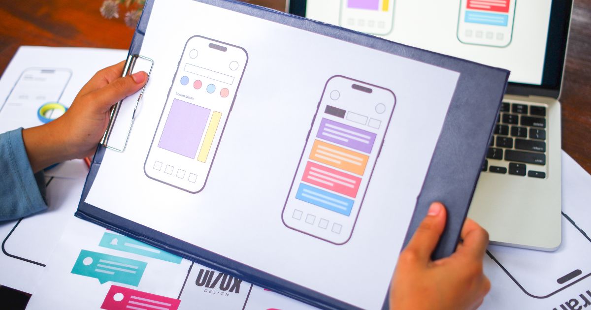
Mobile-first means you design for the smallest screen first — the phone — and then scale up to larger screens from there.
In practice, this means the phone version of your site isn't an afterthought. It's the primary version. The navigation is built for thumbs. The text is readable without zooming. The buttons are big enough to tap without accidentally hitting the wrong thing. The forms work with mobile keyboards. The images load fast even on a cellular connection.
Then, once all of that works perfectly on a phone, you add the enhancements that make the desktop experience better — wider layouts, larger images, more columns, hover effects. The desktop version is the upgrade. The phone version is the foundation.
Think of it this way: your laptop version is what impresses people. Your mobile version is what actually converts them. Most of your visitors are on a phone.
Why Google cares so much about this
In 2019, Google switched to what it calls mobile-first indexing. What that means in plain English is this: when Google crawls your website to decide how to rank it, it looks at the mobile version of your site — not the desktop version.
So if your mobile site is slow, hard to navigate, or missing content that exists on the desktop version, Google sees that as the real version of your site. Your desktop experience — however polished — doesn't factor in as heavily.
This catches a lot of small business owners off guard. They'll spend money on a website that looks great on their laptop, then wonder why it's not ranking on Google. Often the answer is sitting right there on their phone — a slow load, broken layout, or content that doesn't render correctly on mobile.
What to actually check on your own site
You don't need any tools to do a basic mobile audit. Just pull out your phone and go through your site properly.
Does it load in under three seconds on your mobile connection? Count it out — one, two, three. If the page is still loading, that's a problem.
Is the text readable without pinching to zoom? Hold your phone at normal reading distance. If you're squinting or zooming in to read the body copy, your font size is too small for mobile.
Can you tap the navigation, buttons, and links without accidentally hitting the wrong one? Tap targets need to be at least 44 pixels tall. Anything smaller and fingers start missing them, which leads to frustration and exits.
Does the contact form work properly? Fill it in from start to finish on your phone. Check that the keyboard type matches the field — email fields should trigger the email keyboard, phone fields should trigger the number pad. Check that the submit button is visible without scrolling past the keyboard.
Note
One quick test worth doing right now: go to Google and search "mobile friendly test" — the first result is Google's own tool. Paste your URL in and it'll tell you within seconds whether Google considers your site mobile-friendly. If it doesn't, that's your starting point.
The business case, plainly stated
63% of web traffic is on mobile. Google ranks based on your mobile site. Most contact form submissions happen on mobile.
If your mobile experience is broken or just mediocre, you're losing customers you never knew you had — because they bounced before you ever saw them in your analytics.
Mobile-first isn't a trend or a preference. It's just where your customers are. Building for them first isn't optional anymore — it's the baseline.